Faraji Jackson Designs

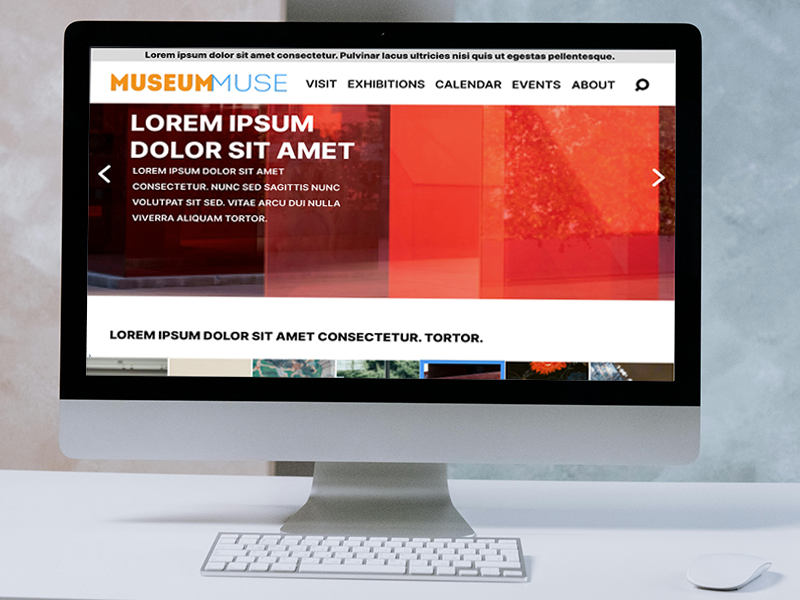
MuseumMuse is an events scheduling app meant to help find museum exhibits and events. The typical user can range from 18 all the way way to the elderly, as most users are late career professionals and the retired. MuseumMuse goal is to make scheduling, and the ability to sync a calendar, simple and easy for any user.
Sept 2024 to Jan 2025
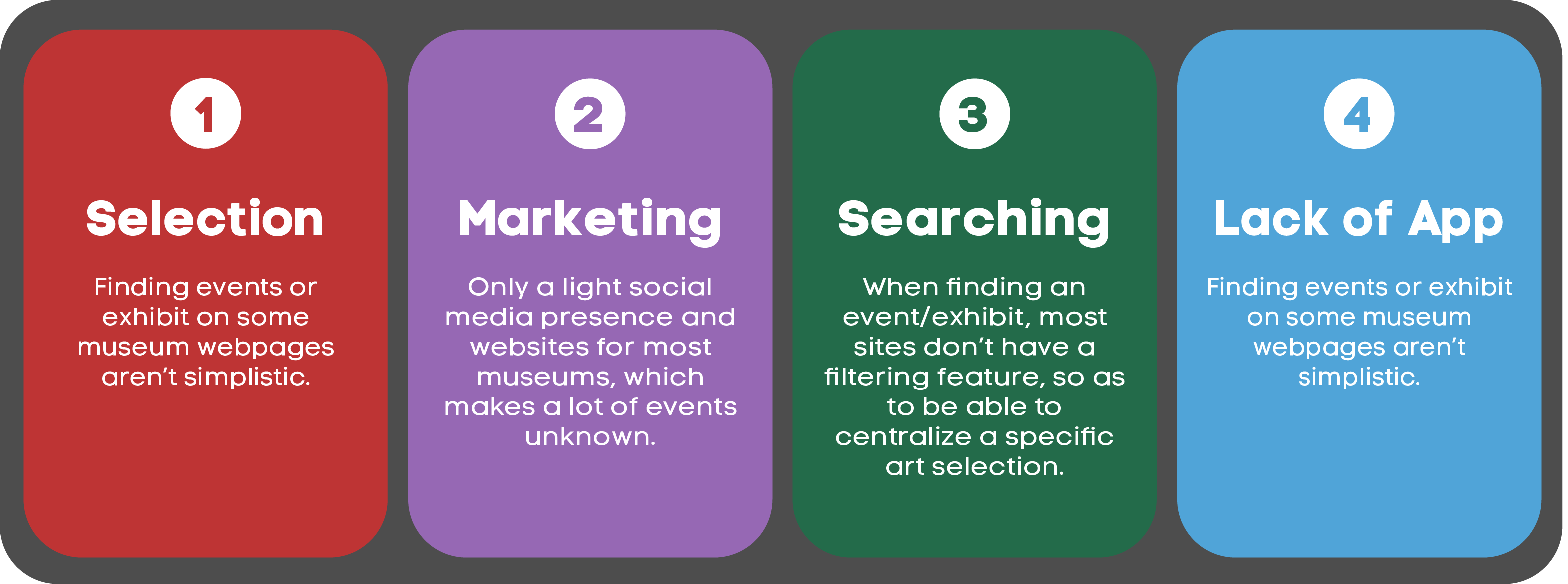
Museum sites do not make it easy to find events and exhibits, as well as save the date, and a lot of them don’t even have apps.
Design the MuseumMuse website and app for users to have no trouble finding and selecting an event or exhibit, then being able to save the date to their device.
UX designer leading the MuseumMuse’s web and app design, as well as the research
Conducting interviews, paper and digital wireframing, low and high-fidelity prototyping, conducting usability studies, accounting for accessibility, iterating on designs and responsive design.
I first looked at different museum websites and apps, in which I learned most museums don’t even have an app. From there, I looked at how museums handled scheduling and ticketing, which I noticed there’s no option to sync a saved/scheduled date to any device. Afterwards, I conducted user interviews, which I turned into empathy maps to better understand the purchasing and scheduling practices of museum patrons. I discovered that most apps weren’t simplistic to users, and finding events could be a hassle.
Problem statement: Janice is a retired Health Policy Analyst who needs a museum with an active website and events calendar because a lot of museums don’t have apps or consistently updated websites for upcoming events.
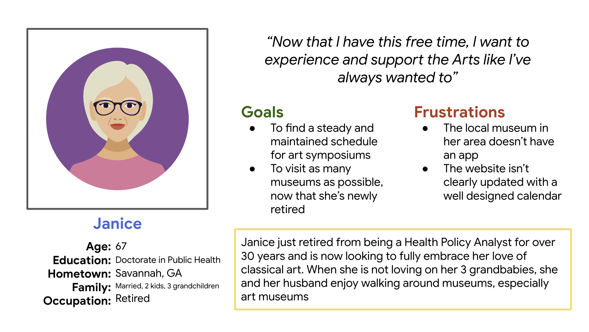
Creating a user journey map of the user Janice allowed me to help identify possible pain points and improvement opportunities that came from her experiences from museum searches.

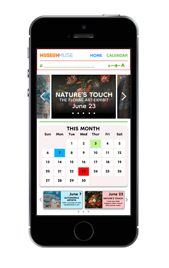
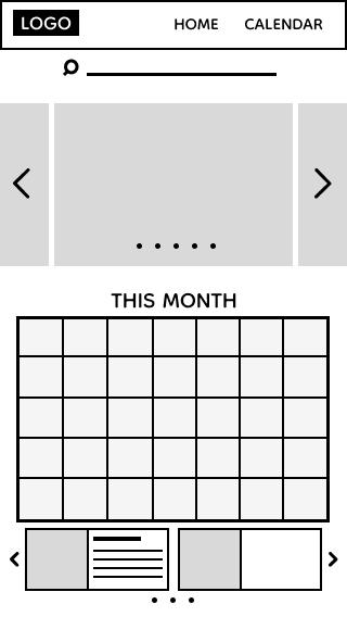
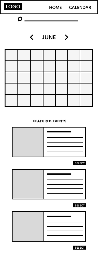
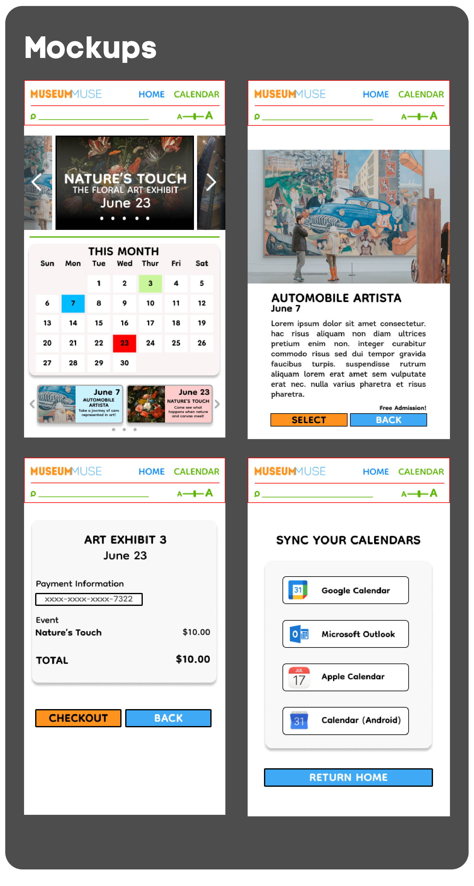
To begin the process, I sketched out several paper wireframes for the home screen, carefully selecting the parts that I felt were the strongest, and culminating a final wireframe that allowed users to see events front and center.
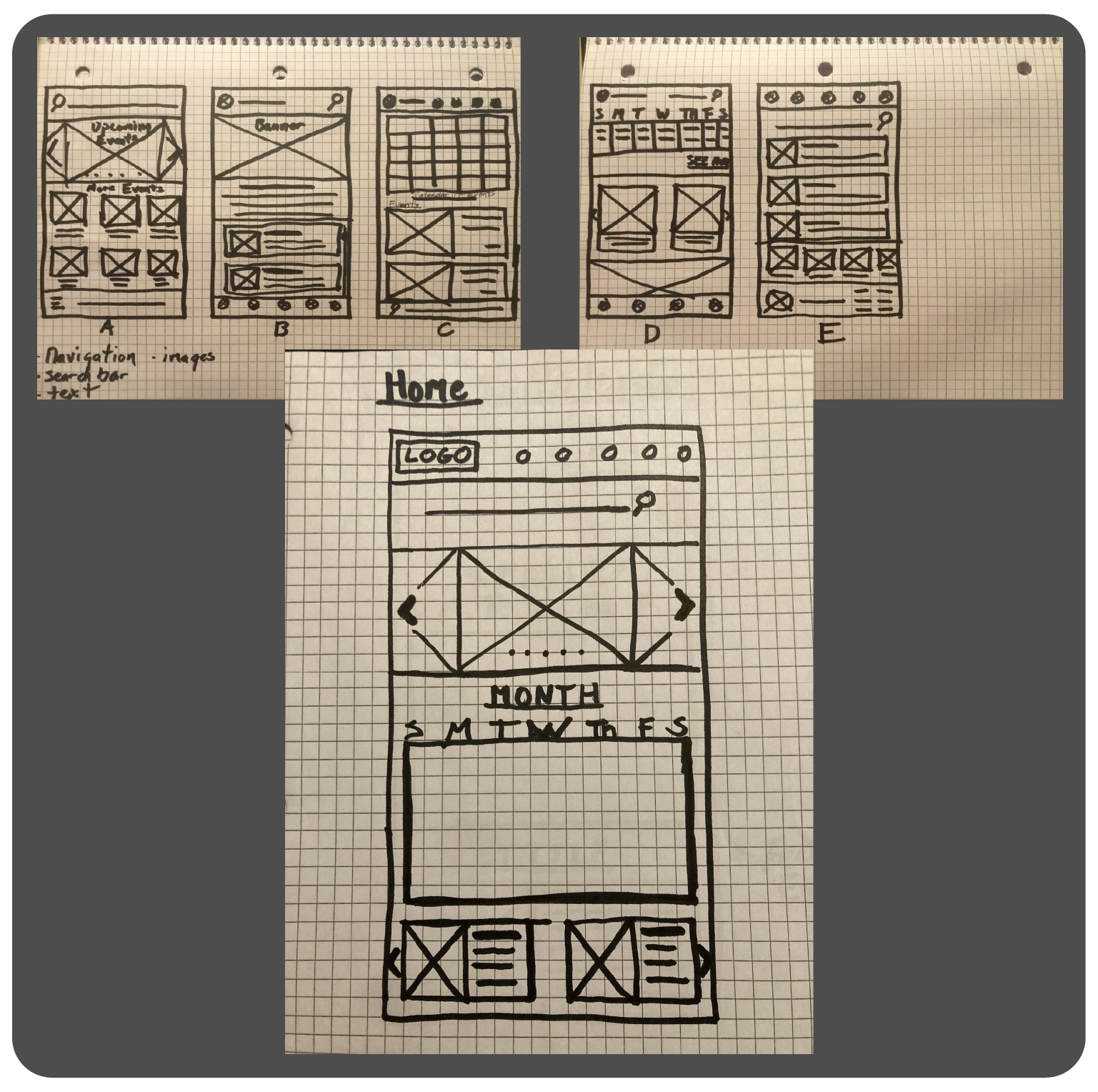
After drawing out final designs for the paper wireframes, the move to digital was a simple process. It allowed me to see exactly what would work for a user in real time.
Making sure a calendar and visible event dates was a priority for user simplicity and accessibility
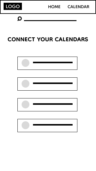
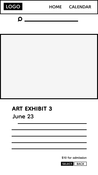
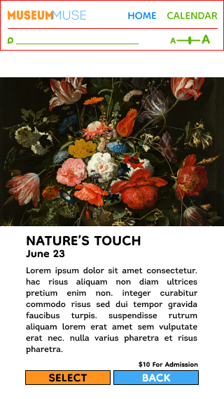
The second key factor I wanted to implement was the ability to save any event or exhibit the user had scheduled. The average sites didn’t include that option, so to be able to insert something scheduled in your own calendar was part of my design plan.
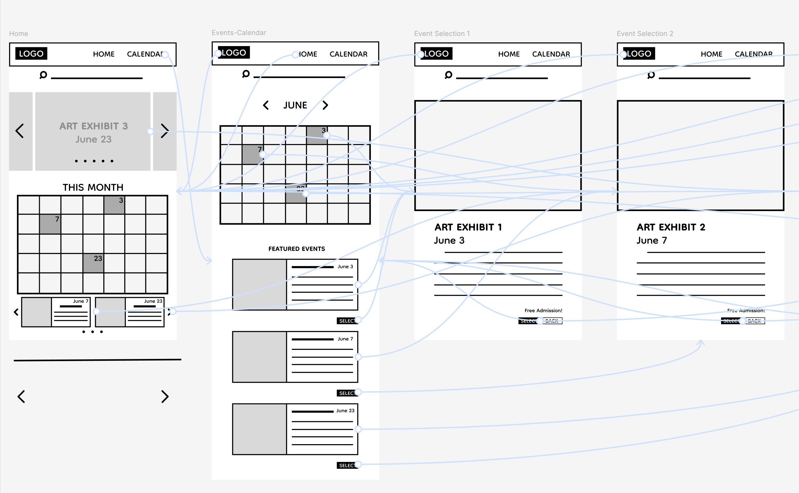
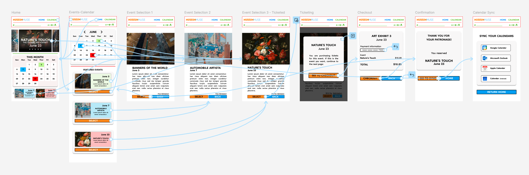
In order to make my low-fidelity prototype, I established how the user would flow through the navigation and then I connected all the screens. I wanted to make sure that the main pain points I seen from my research and interviews were top of the things addressed, like having a very distinct and visual calendar, and quick navigation to the available events.

After getting the lo-fi prototype fully operational, I had a few users test out the functionality and accessibility of the initial app design.
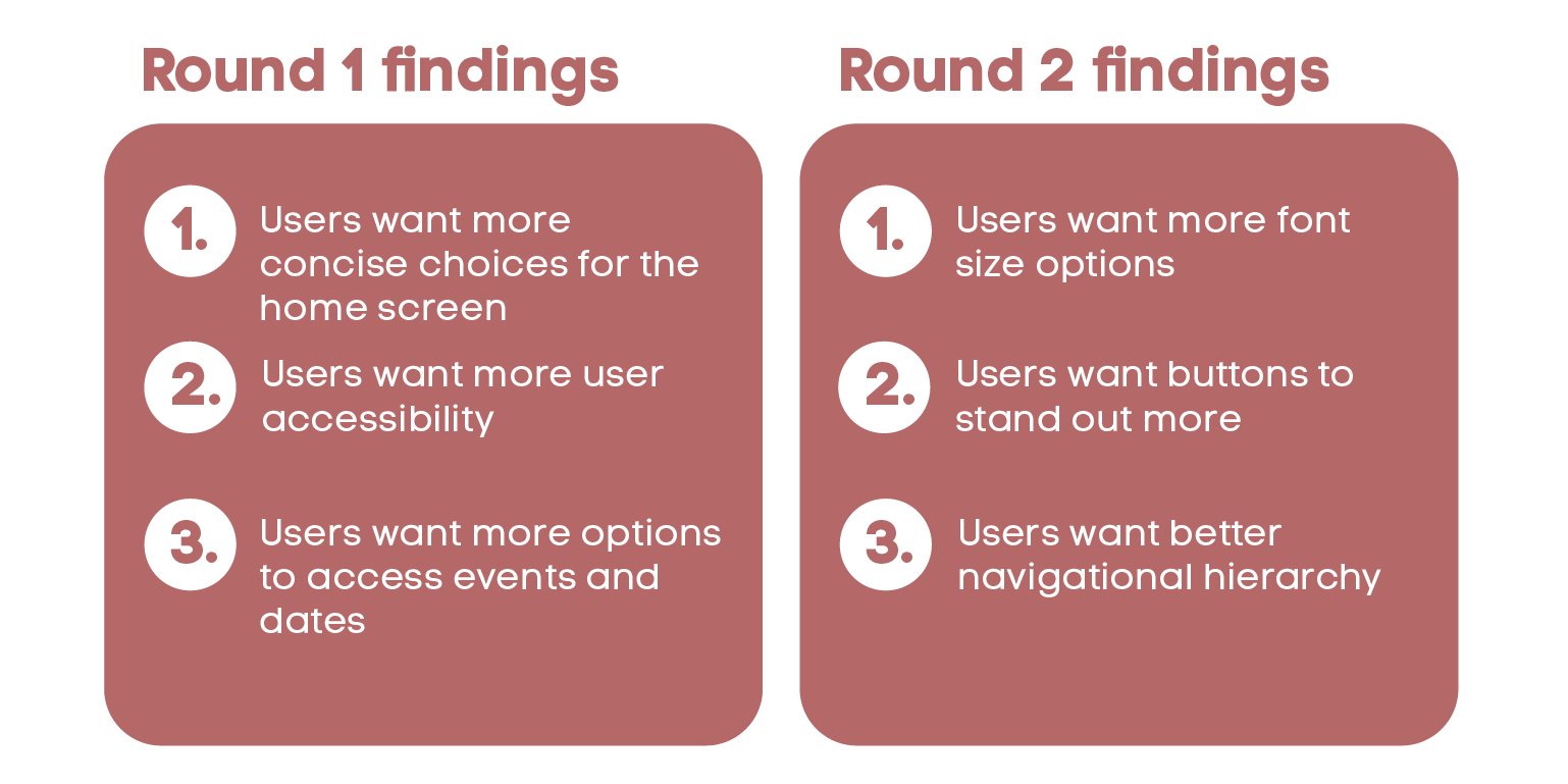
Taking the inputs from the usability study in regard, I made changes to the calendar and event selection aspect so improve the site flow of selection. I used color and typography to show hierarchy.
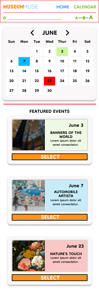
I wanted to make the process of knowing what to select stand out more, by using color and increasing the font. I also streamlined the design of the overlay frames.

Impact:
Our target users loved the inclusion of syncable calendar dates, and the simplicity of the app’s design. The straightforwardness of the navigation was also a big plus
What I learned:
I learned that the research and the usability testing is very crucial to making a equitable and functional design. The most important takeaway for me is understanding that a design needs to be made with users first in mind, and no personal bias.