Faraji Jackson Designs
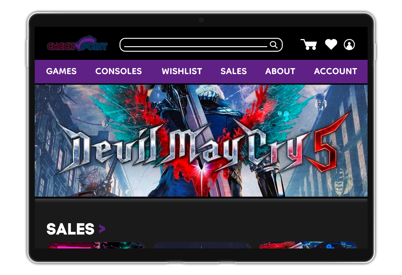
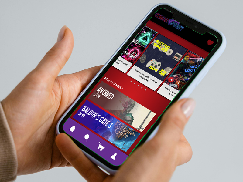
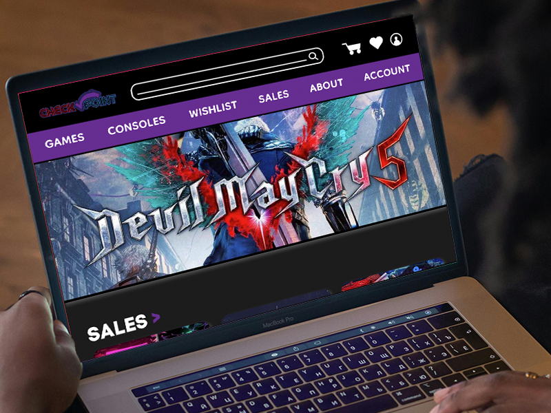
CheckPoint is an gaming supplies website meant to help in purchasing gaming equipment. The typical user can range from 18 to early 50s, usually early career professionals for themselves, and mid/late career professionals with families. CheckPoint’s goal is to make an easy, accessible web experience for gamers to shop.
Jan 2025 to Feb 2025
Ecommerce gaming sites aren’t really encouraging lately, because the sites tend to be difficult to navigate, and they have licensing and refund issues.
Design the CheckPoint website for users to have the ability to purchase all their gaming needs from a simple hub, and make refunding a product uncomplicated as humanly possible.
UX designer leading the MuseumMuse’s web and app design, as well as the research
Conducting interviews, paper and digital wireframing, low and high-fidelity prototyping, conducting usability studies, accounting for accessibility, iterating on designs and responsive design.
My research began with me looking at game retailer sites, and seeing how they were designed and what they usually sold. Then I looked at what products users would generally need and purchase. I then conducted user interviews, which I turned into empathy maps to better understand the purchasing, licensing, and refund practices of gaming retail webpages. I discovered that most websites didn’t have solid licensing and return policies, and most users preferred actual face-to-face purchasing.
Problem statement: Wes is a History Teacher who is looking for a good online gaming retailer to supply his needs for himself and his 2 children, because he is looking to expand his gaming to desktop, and for better deals
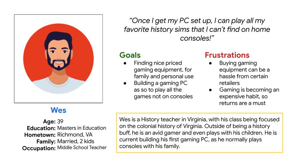
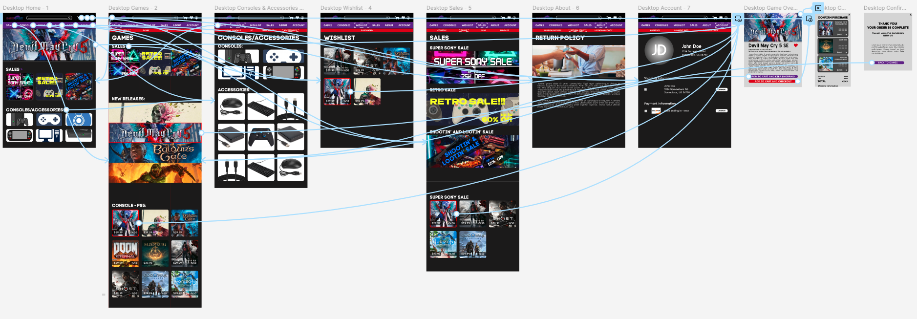
Creating a user journey map of the user Wes allowed me to help identify possible pain points and improvement opportunities that came from his experiences from online gaming supply searches.
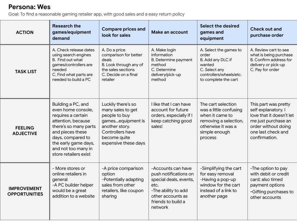
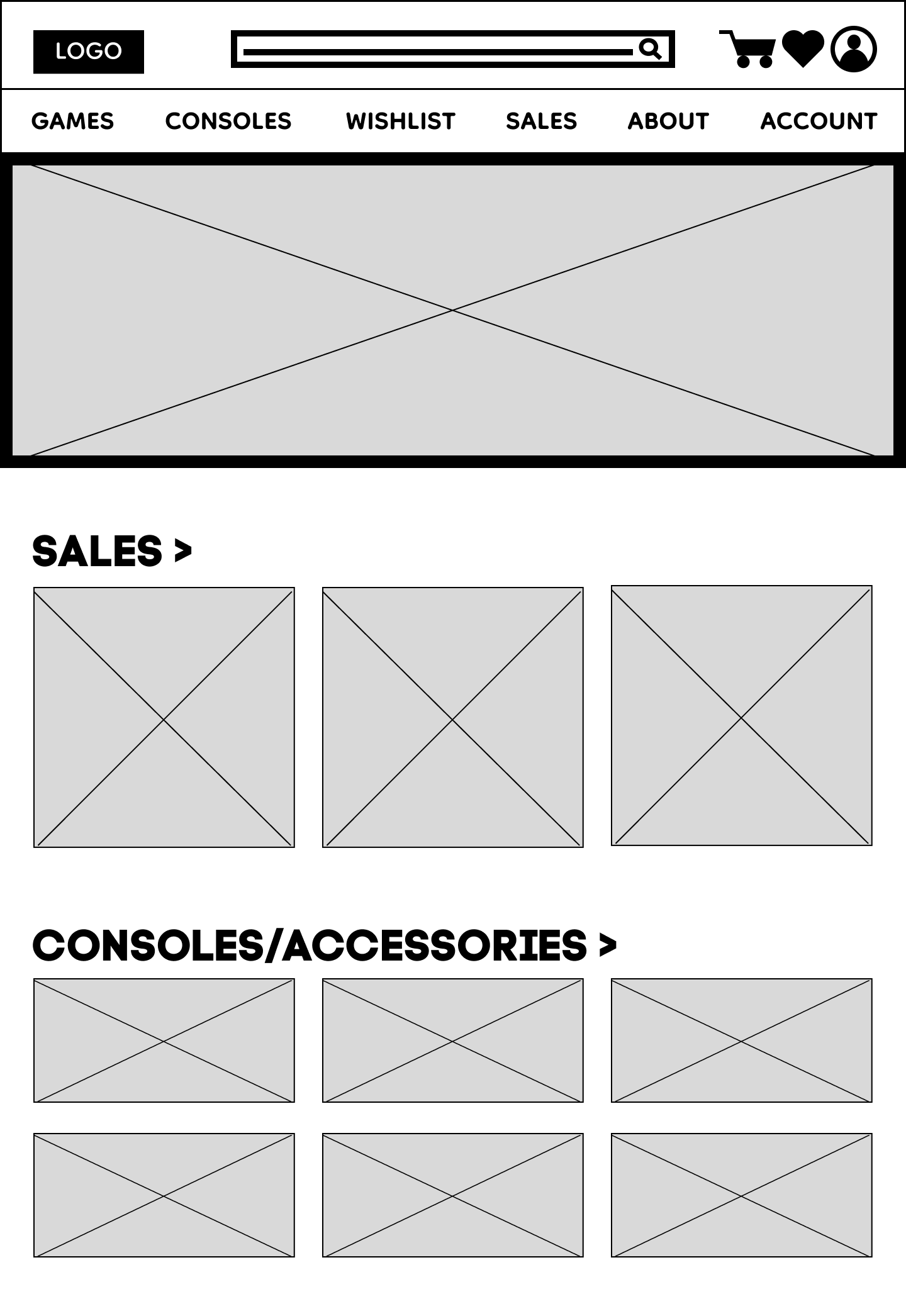
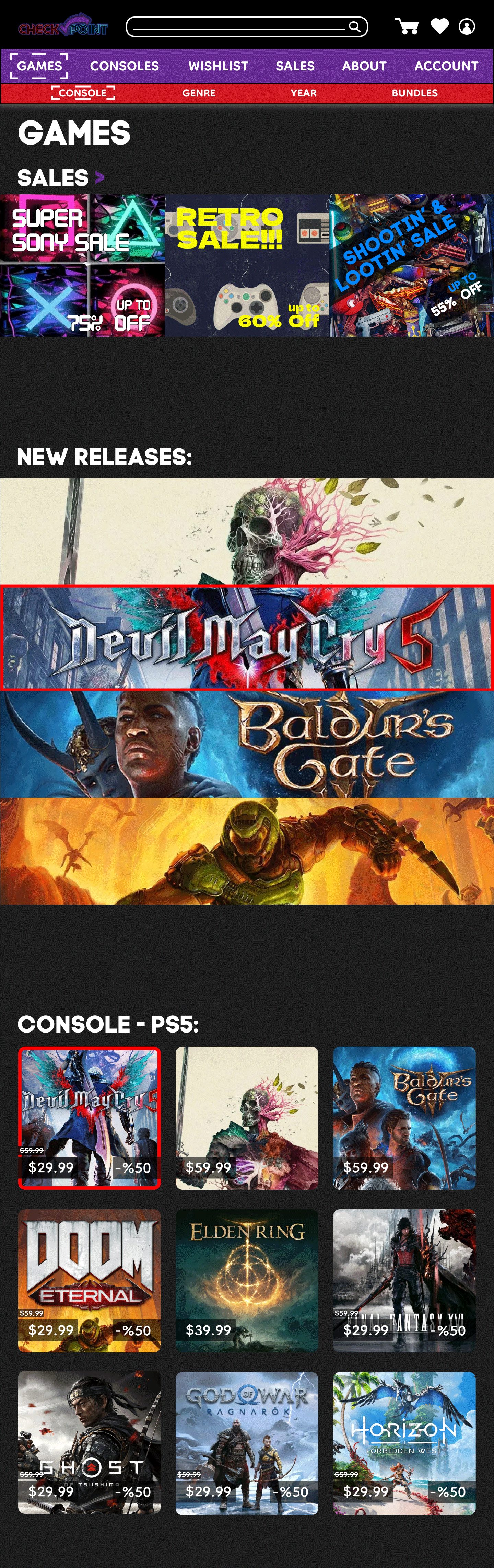
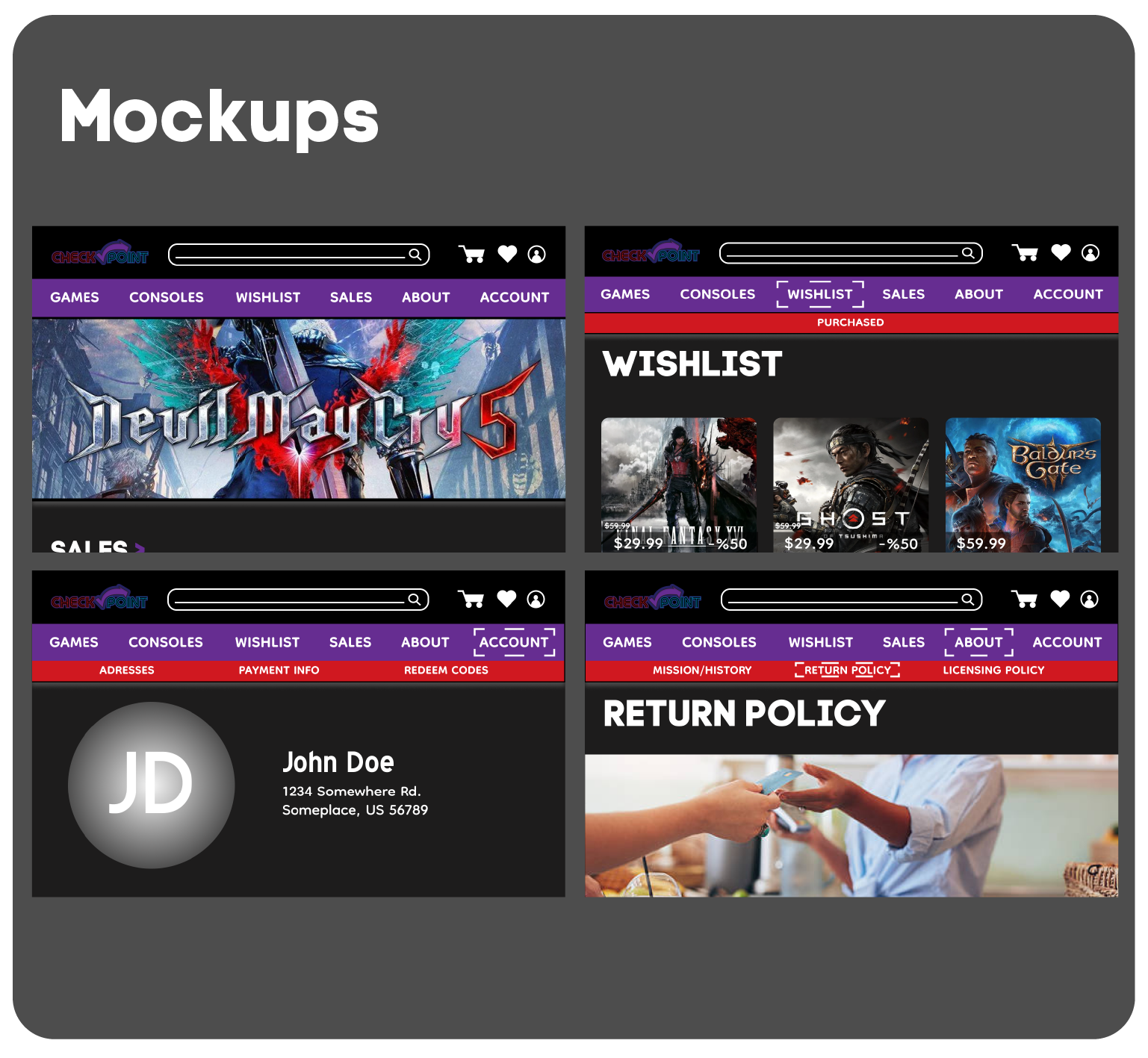
One of the bigger pain points was that users generally didn’t find online shopping appealing or easily accessible, so I wanted to address those two issues by establishing a clearly defined hierarchy with sales and new releases highlighted first, and then simplicity in finding games and accessories.
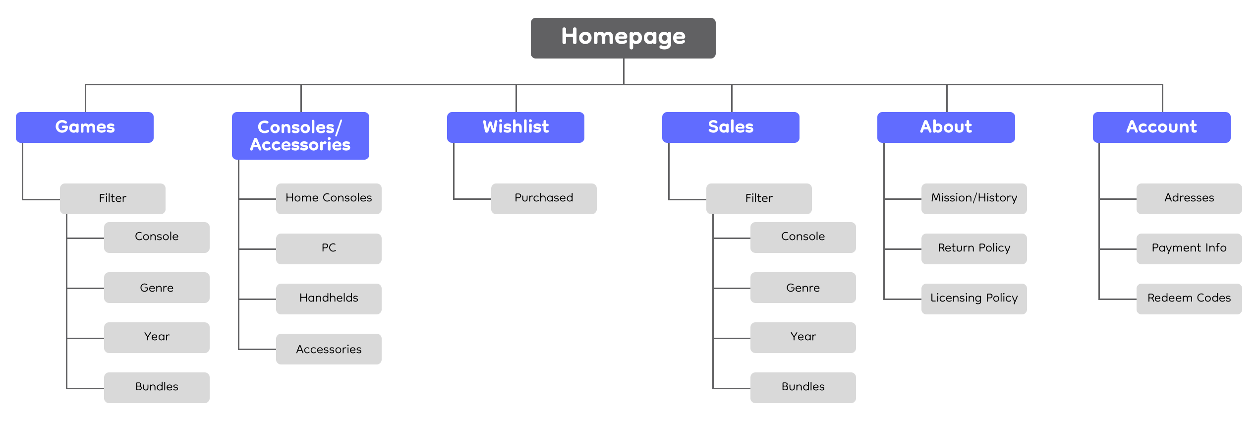
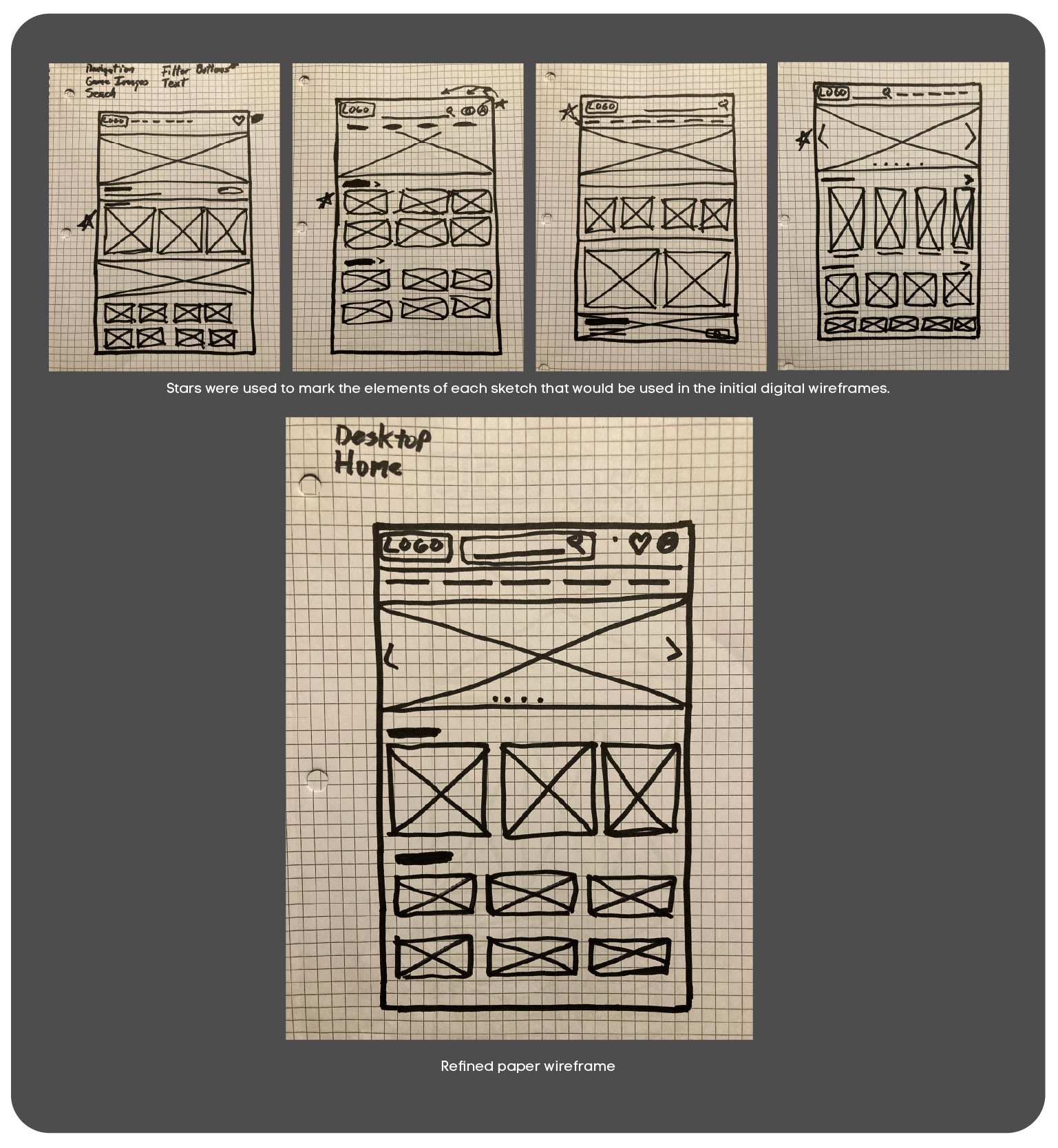
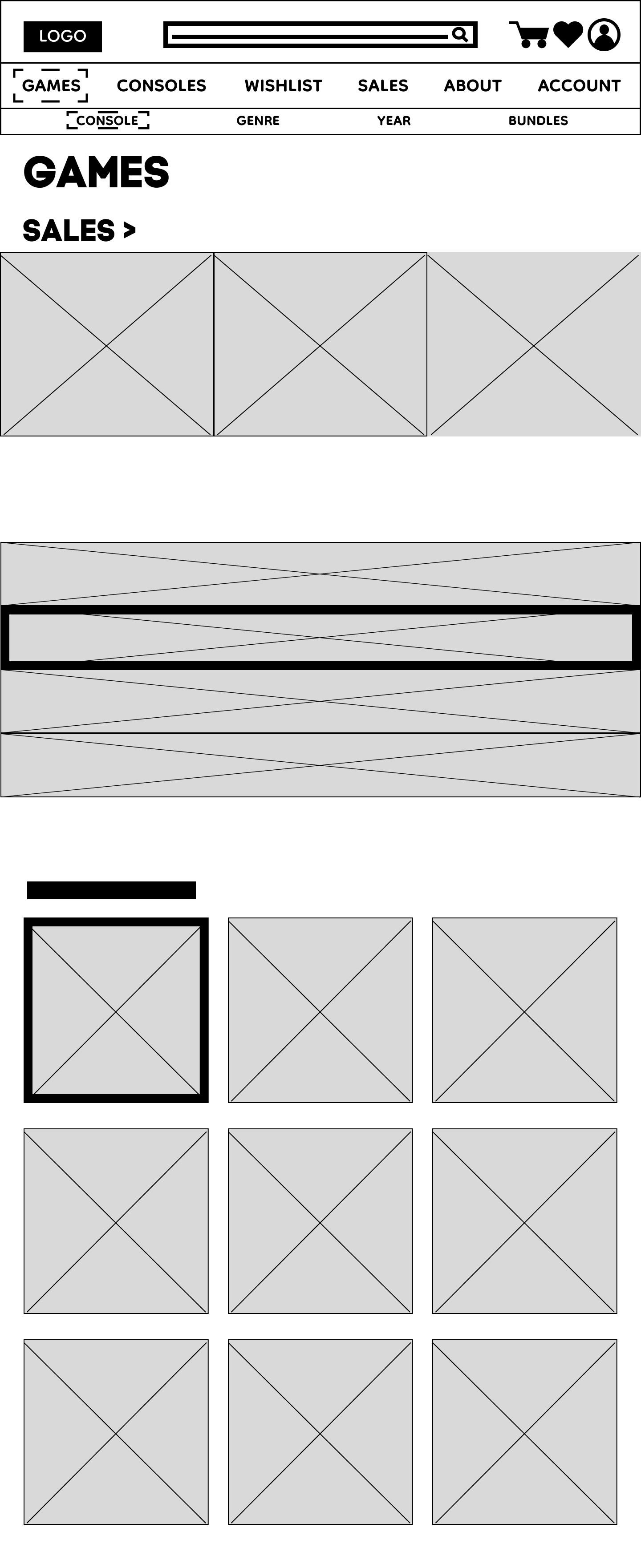
My first factor was sketching out several paper wireframes for the home screen, in order to select parts that fit my design idea to make the games selection stand out. The final wireframe allowed users to see games and sales as the main focal point.
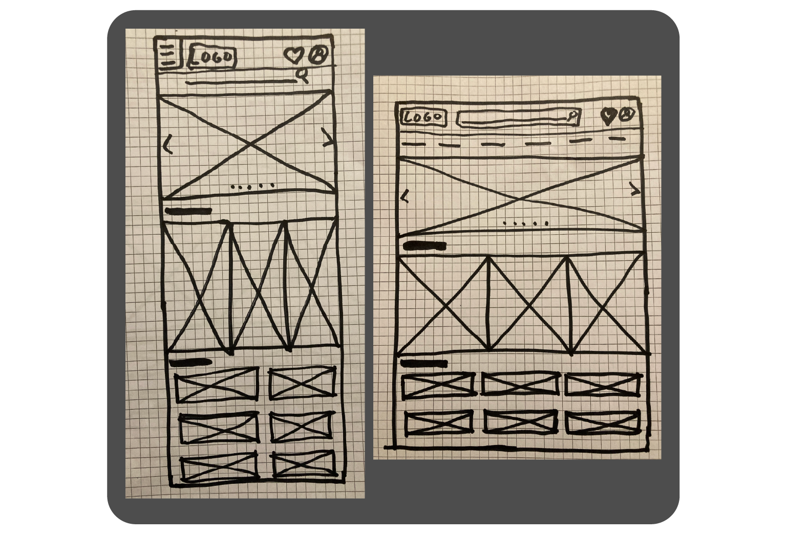
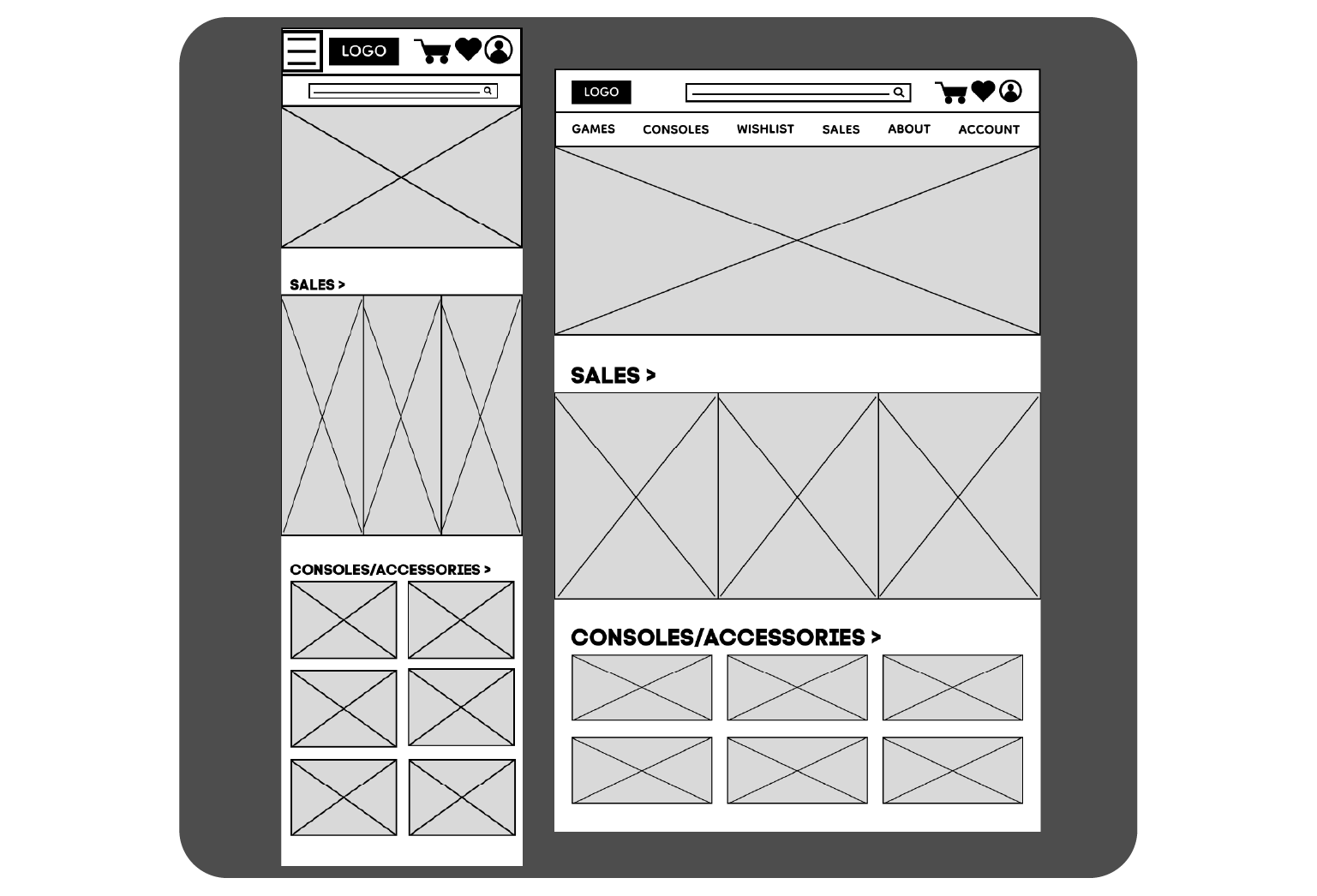
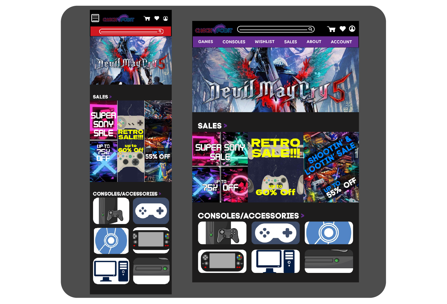
I made sure I designed layouts for different devices, knowing that as a gamer myself, users shop on a variety of devices, so the design needs to be responsive.
With my paper wireframes for reference, developing a homepage that make the main focus of easy access to games and sales was the focal point of the design. I wanted to show new releases and sales first to ease the activity of purchasing to users that don’t normally shop online
Making the framework for the user flow by creating a simple navigation and non-complex layout design is how I established my low-fidelity prototype. For the app, I knew that I couldn’t focus on returns, but I could grasps the pain point of not purchasing online by highlighting sales and easy access to pricing.


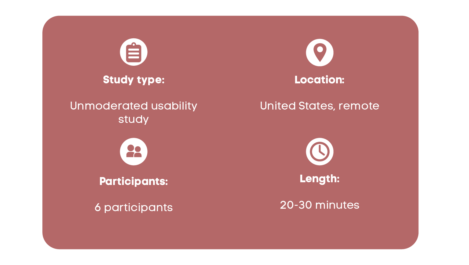
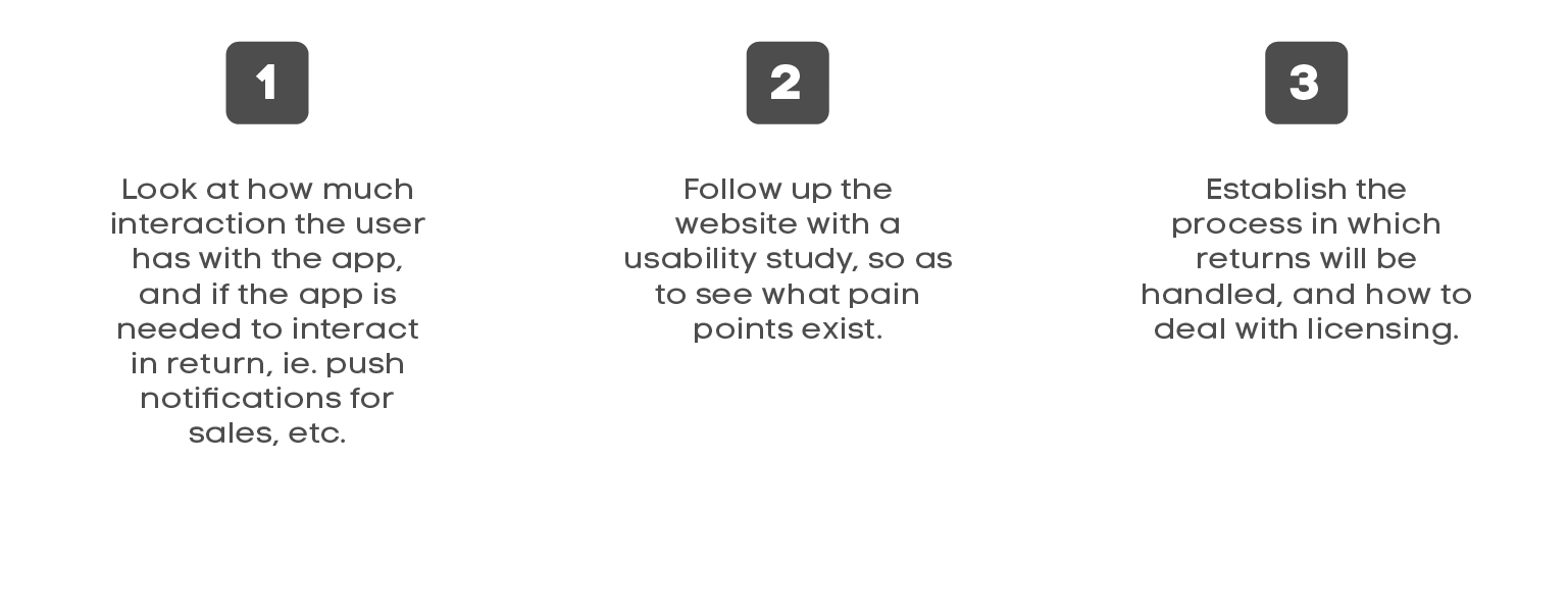
These were the main findings uncovered by the usability study:
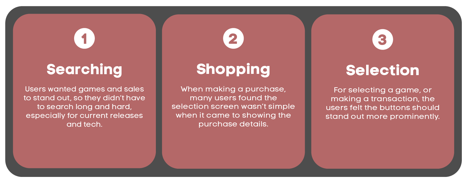
I wanted to make sure the event selection aspect stood out in the site flow. I used images,color and typography to show that this is at the top of the hierarchy.
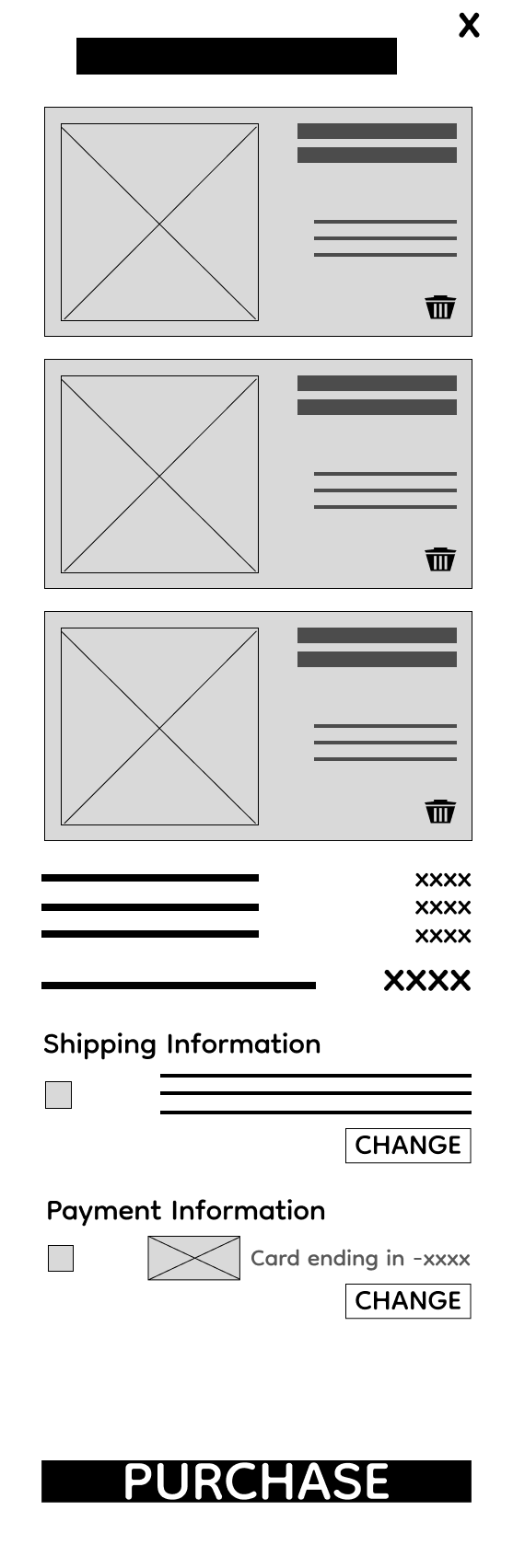
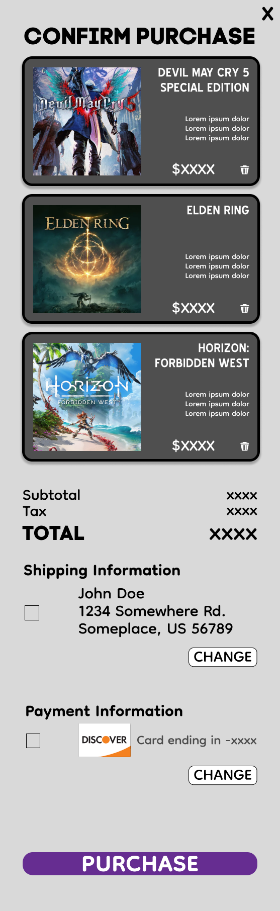
I wanted to make the process of knowing the details of what was selected stand out more, by using color and increasing the font. I also streamlined the design of the overlay frames.

Impact:
Our target users loved the improvement within the navigation and how accessible and visible any category or game selection was. It was easy to access and easy to complete a process.
What I learned:
I learned that without detailed research, attacking the pain points established is nearly impossible. The most important takeaway for me is understanding what a user is feeling and dealing with in a design, then being open to various solutions in order to solve them.