Faraji Jackson Designs
MuseumMuse is an events scheduling app meant to help find museum exhibits and events. The typical user can range from 18 all the way way to the elderly, as most users are late career professionals and the retired. MuseumMuse goal is to make scheduling, and the ability to sync a calendar, simple and easy for any user.
Sept 2024 to Jan 2025
Museum sites do not make it easy to find events and exhibits, as well as save the date, and a lot of them don’t even have apps.
Design the MuseumMuse website and app for users to have no trouble finding and selecting an event or exhibit, then being able to save the date to their device.
UX designer leading the MuseumMuse’s web and app design, as well as the research
Conducting interviews, paper and digital wireframing, low and high-fidelity prototyping, conducting usability studies, accounting for accessibility, iterating on designs and responsive design.
I first looked at different museum websites and apps, in which I learned most museums don’t even have an app. From there, I looked at how museums handled scheduling and ticketing, which I noticed there’s no option to sync a saved/scheduled date to any device. Afterwards, I conducted user interviews, which I turned into empathy maps to better understand the purchasing and scheduling practices of museum patrons. I discovered that most apps weren’t simplistic to users, and finding events could be a hassle.
Problem statement: Janice is a retired Health Policy Analyst who needs a museum with an active website and events calendar because a lot of museums don’t have apps or consistently updated websites for upcoming events.
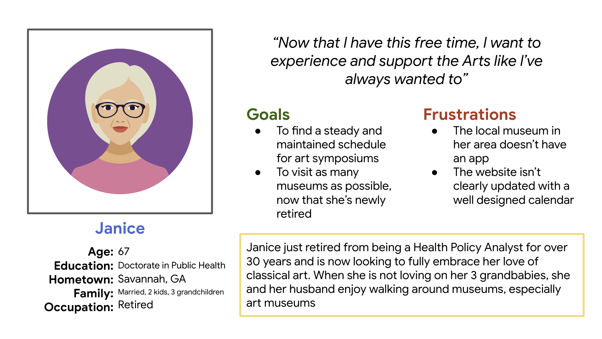
Creating a user journey map of the user Janice allowed me to help identify possible pain points and improvement opportunities that came from her experiences from museum searches.

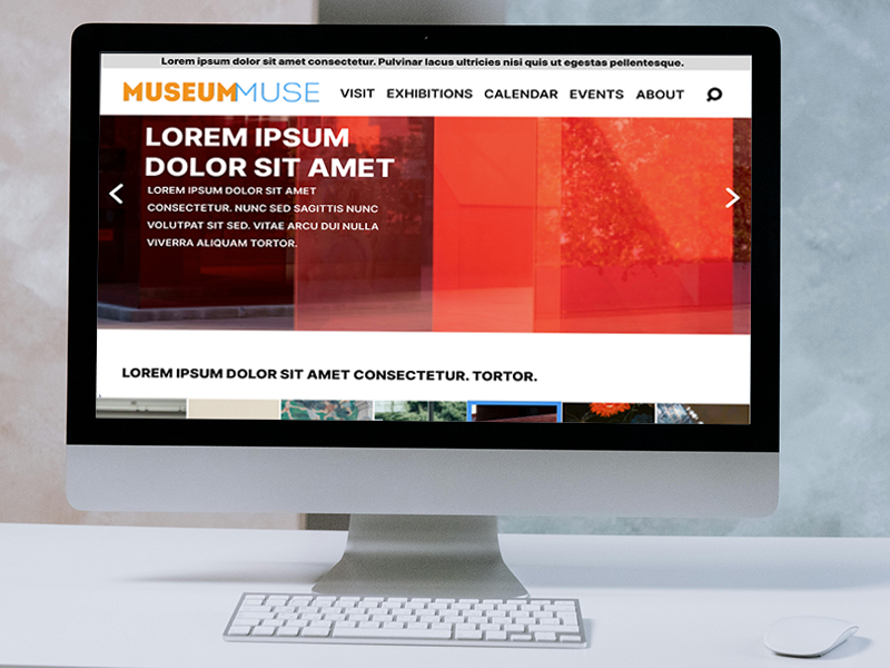
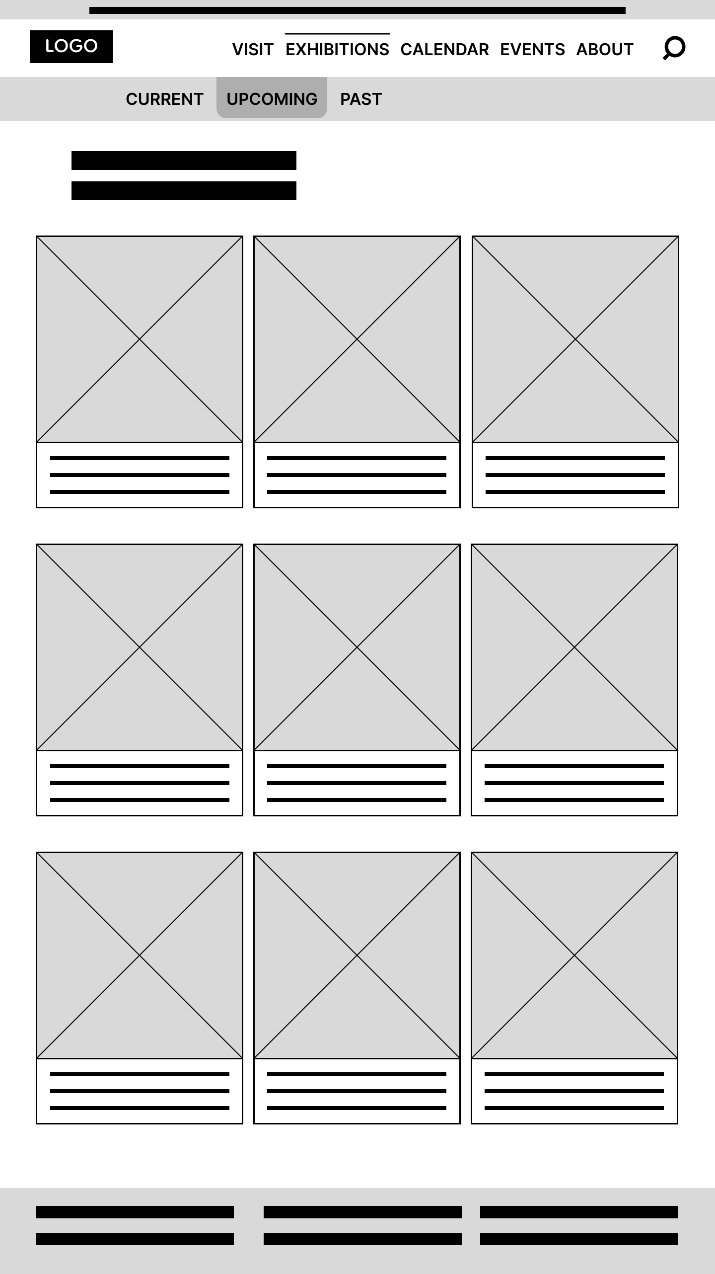
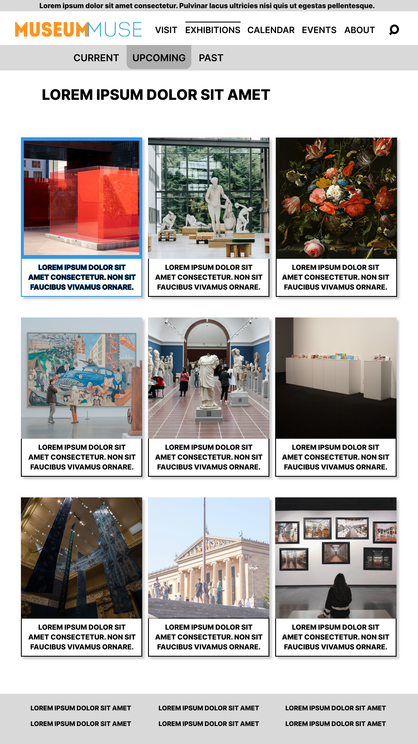
Not easily seeing and finding events and exhibits was a strong user pain point that I wanted to address with my sitemap layout.
In order to address the goal of making the visual marketing more prominent and accessible, I needed to adjust the strategic information architecture decisions, so as that the structure I chose made things front and center for better efficiency.
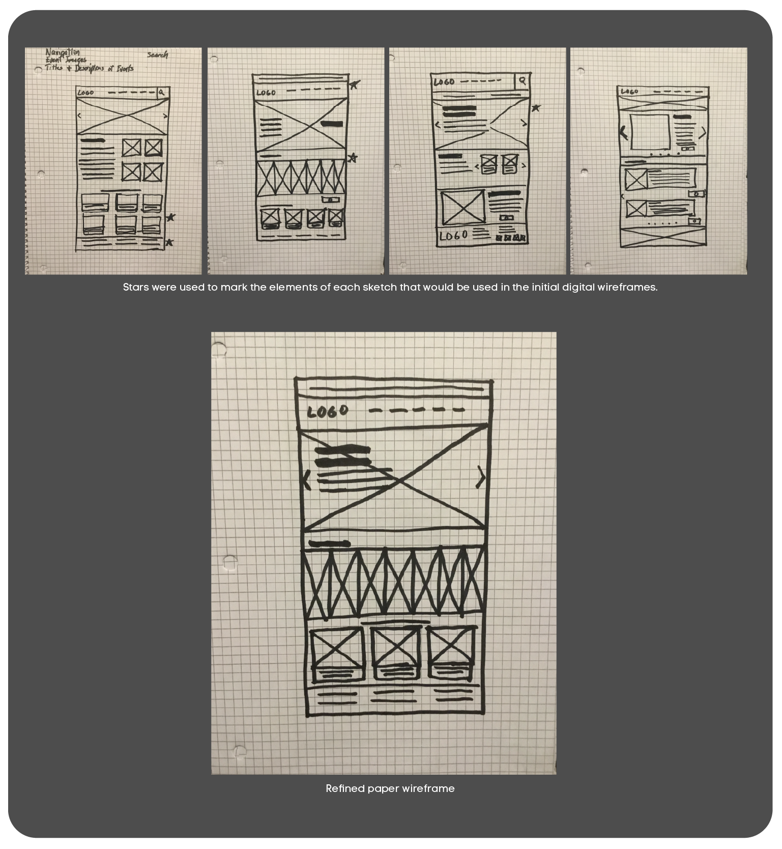
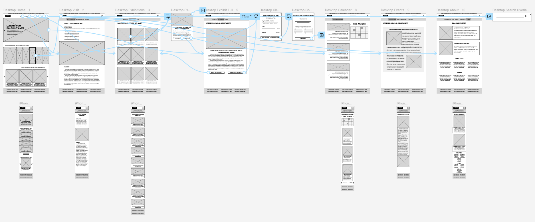
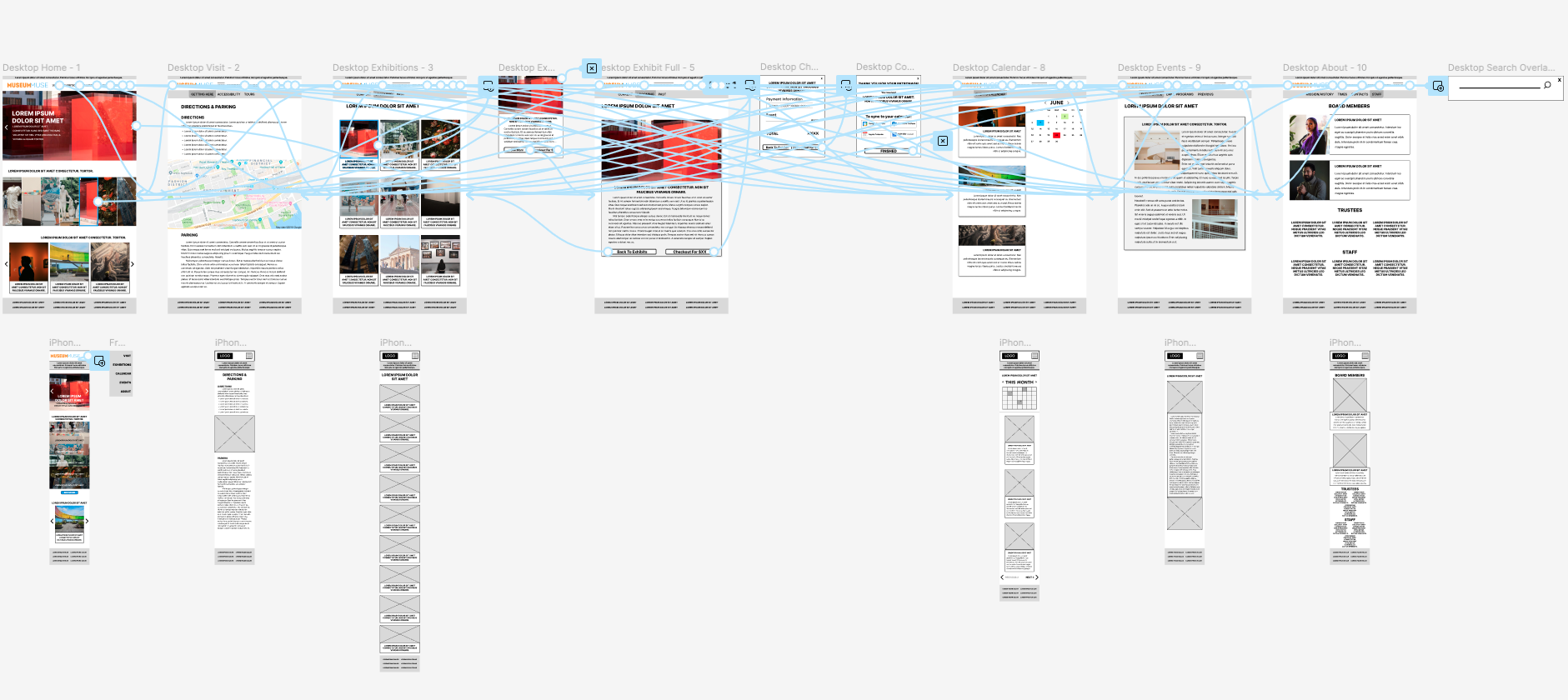
To begin the process, I sketched out several paper wireframes for the home screen, carefully selecting the parts that I felt were the strongest, and culminating a final wireframe that allowed users to see events front and center.
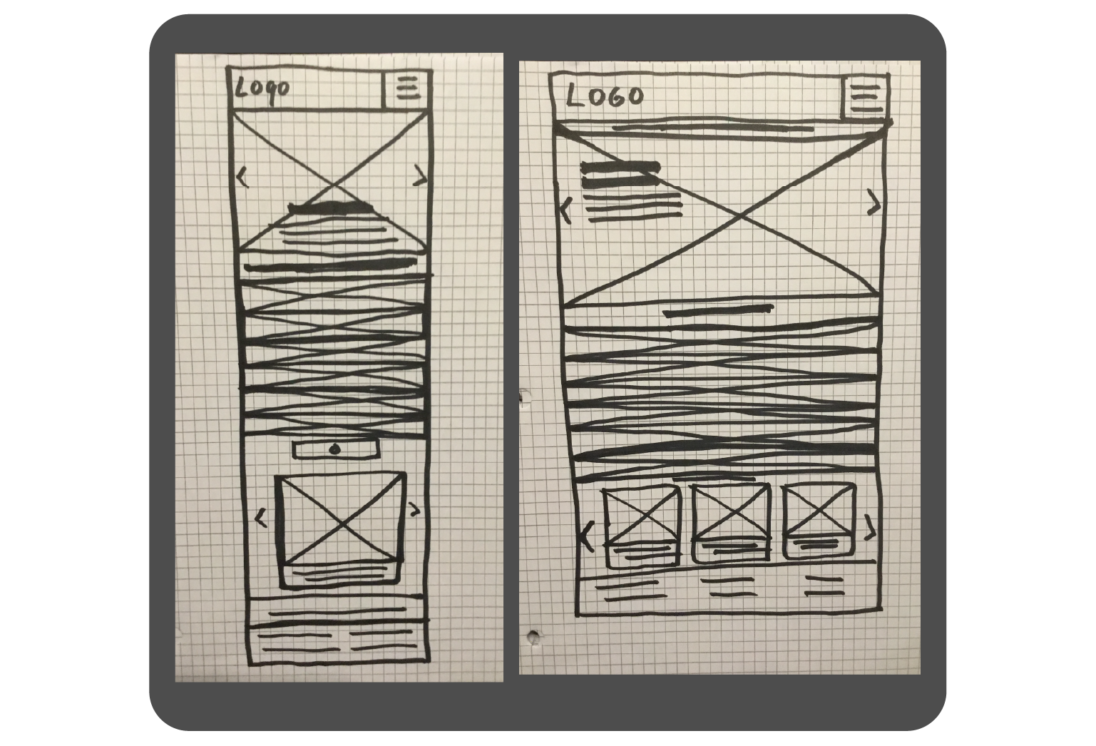
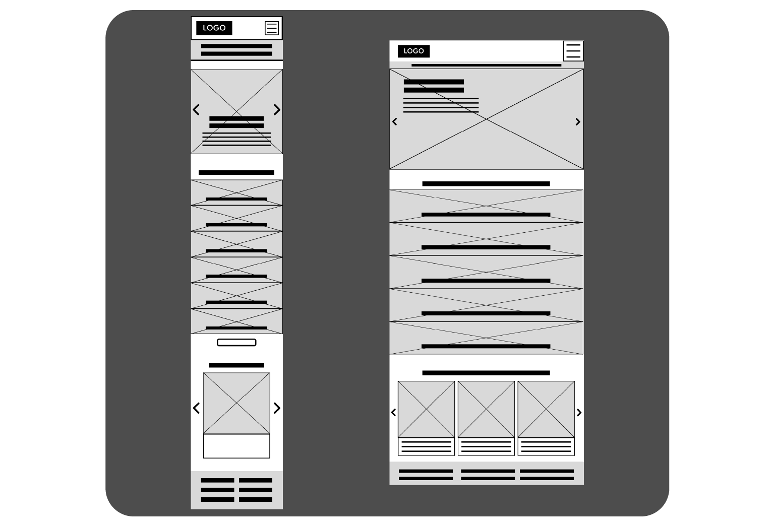
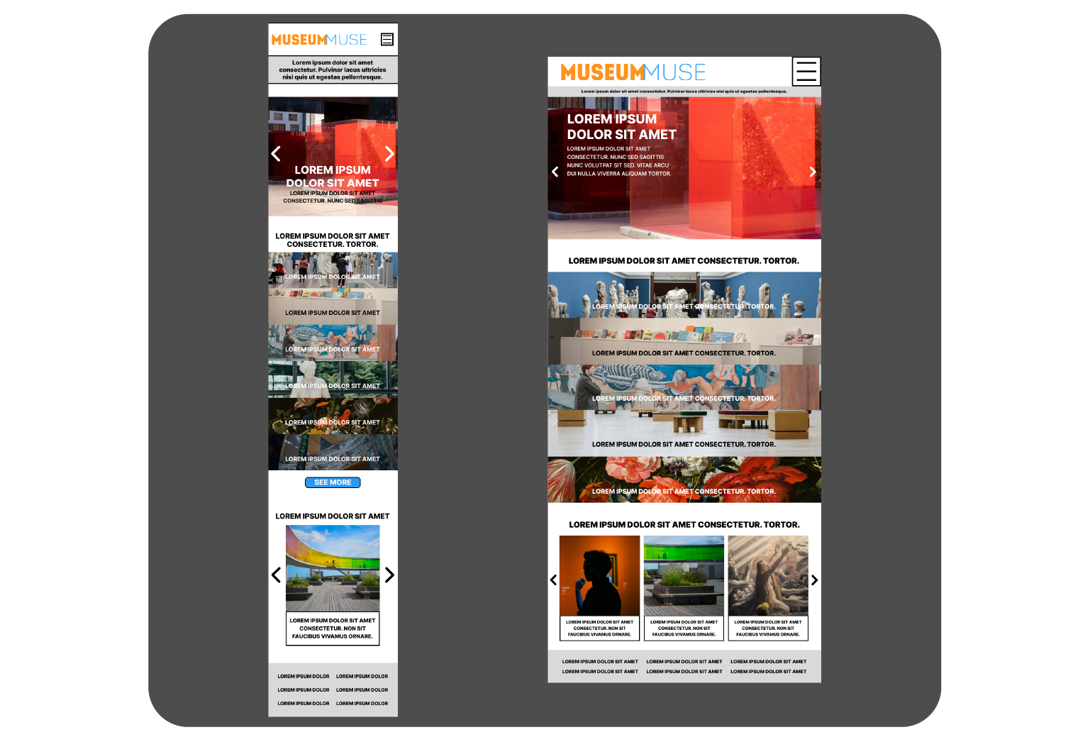
I made sure I designed layouts for different devices, because I know museum users come in a wide variety. I need to see that the design would work responsively.
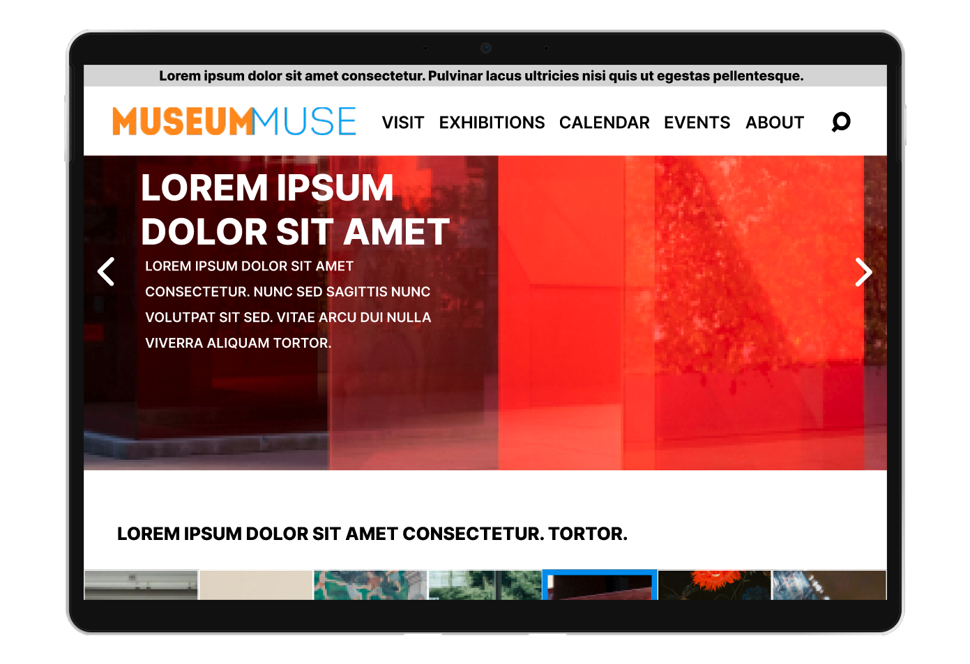
Using my paper wireframes as a foundation, I was able to develop a design with the events and exhibitions accessible at first glance.
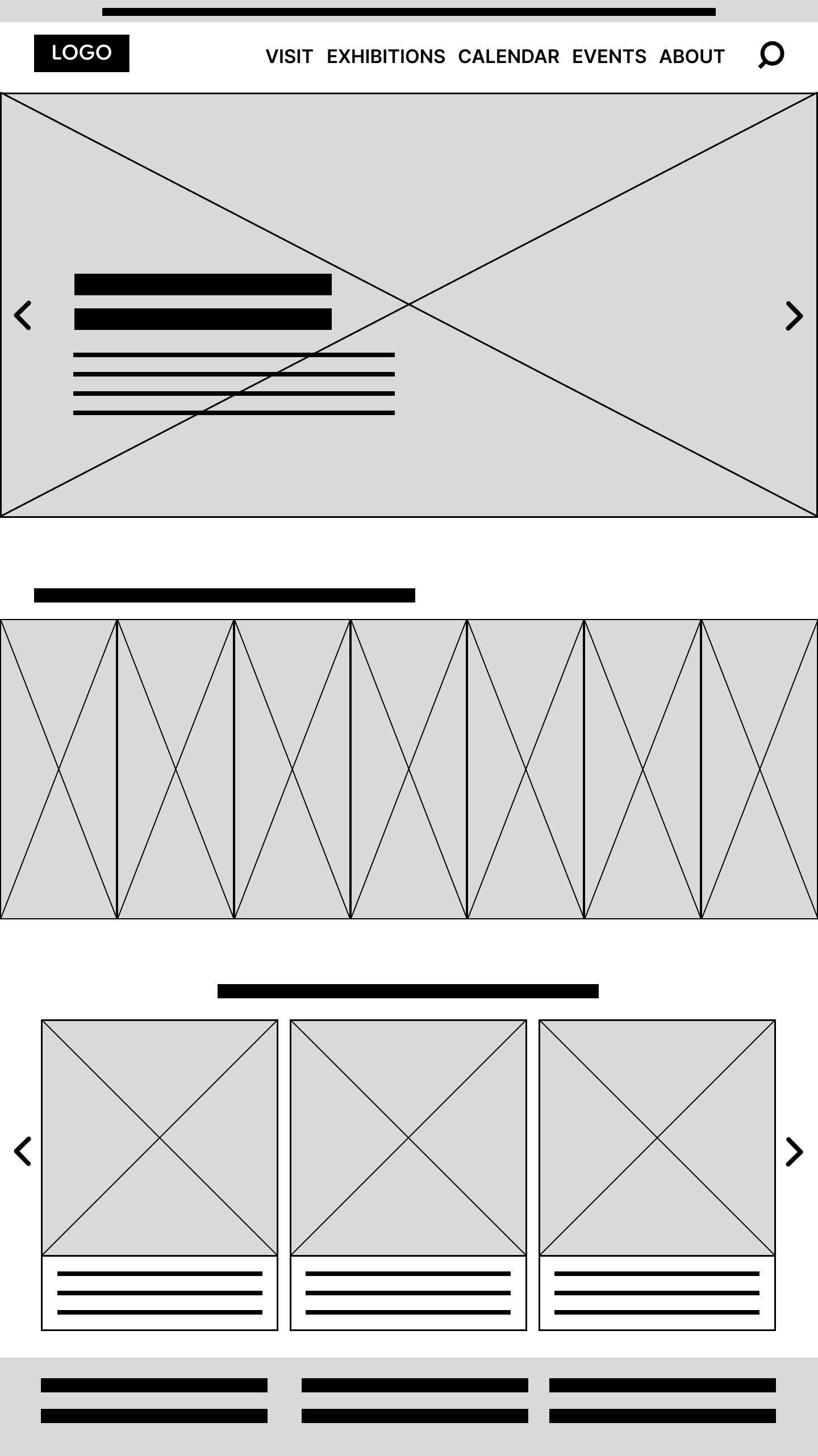
Allowing users to see all the current events front and center was the main focal point, for ease of each and selection.
In order to make my low-fidelity prototype, I had to determine what layout would allow the user to have immediate access to event selection, yet keep easy navigation when I connected all the screens. Addressing user pain points from my research and interviews allowed me focus on event placement and highlighting dates so users could find and select with little hitches.

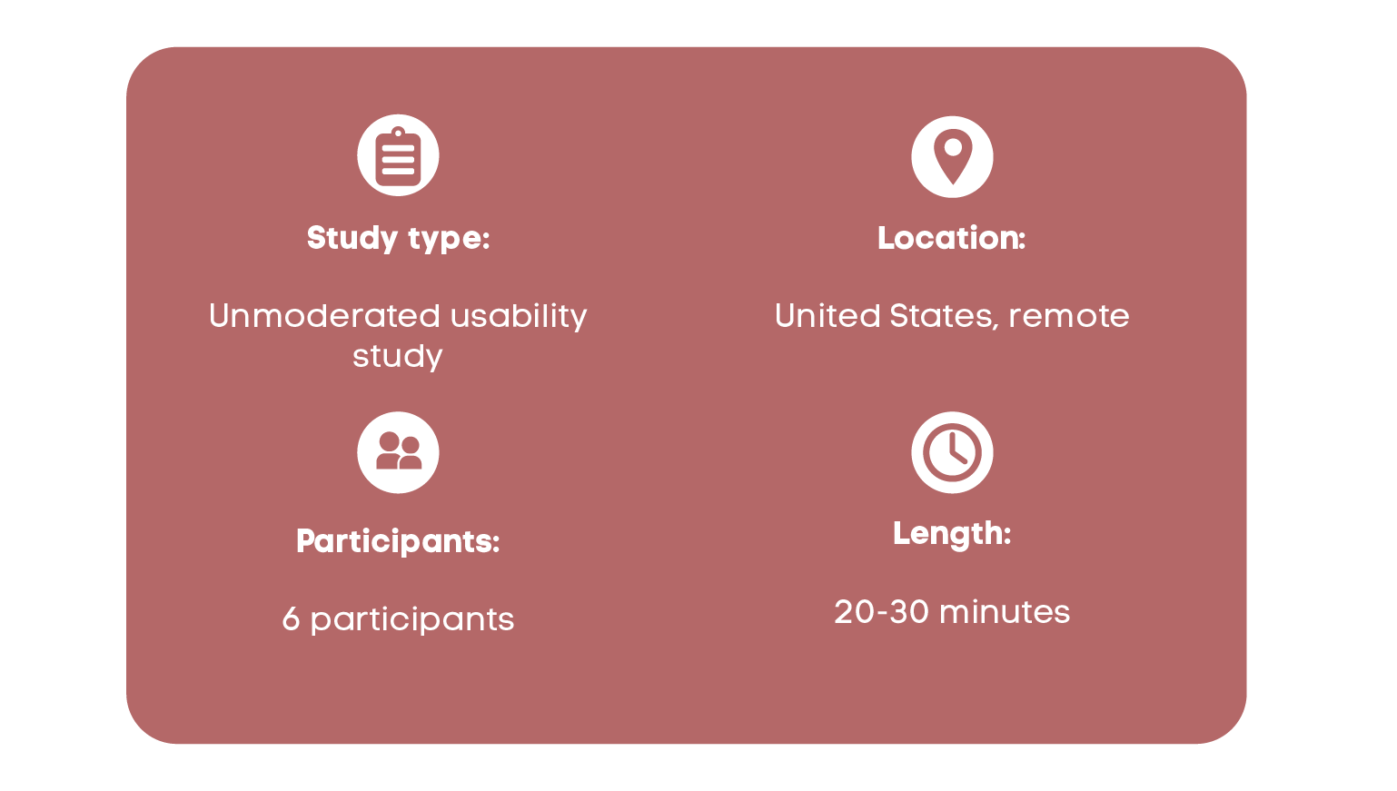
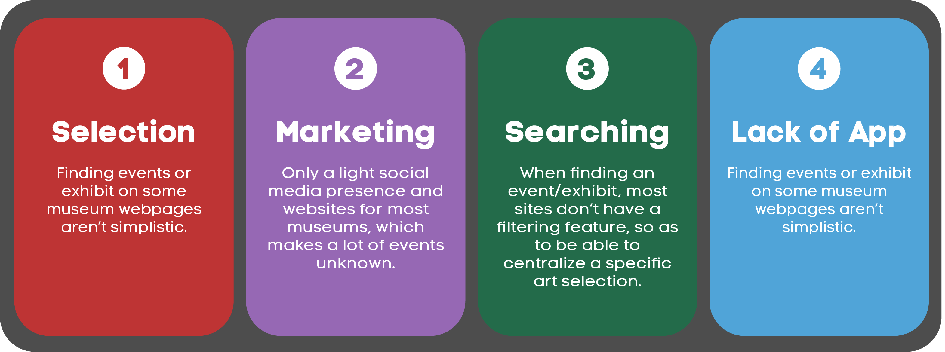
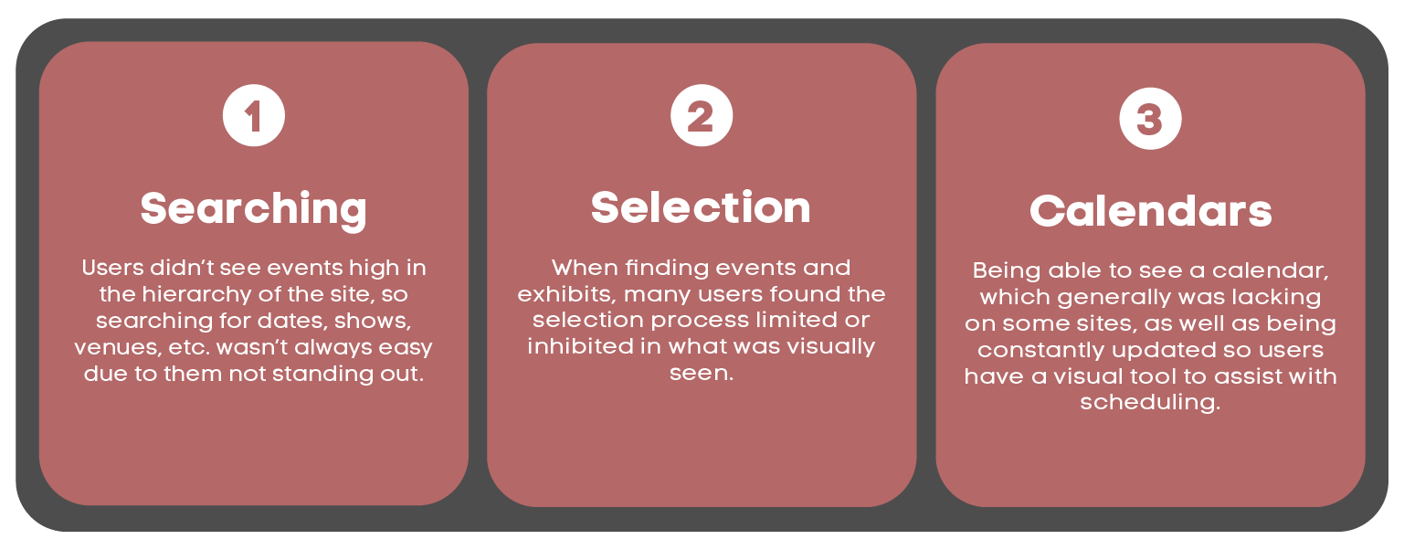
These were the main findings uncovered by the usability study:
I wanted to make sure the event selection aspect stood out in the site flow. I used images,color and typography to show that this is at the top of the hierarchy.
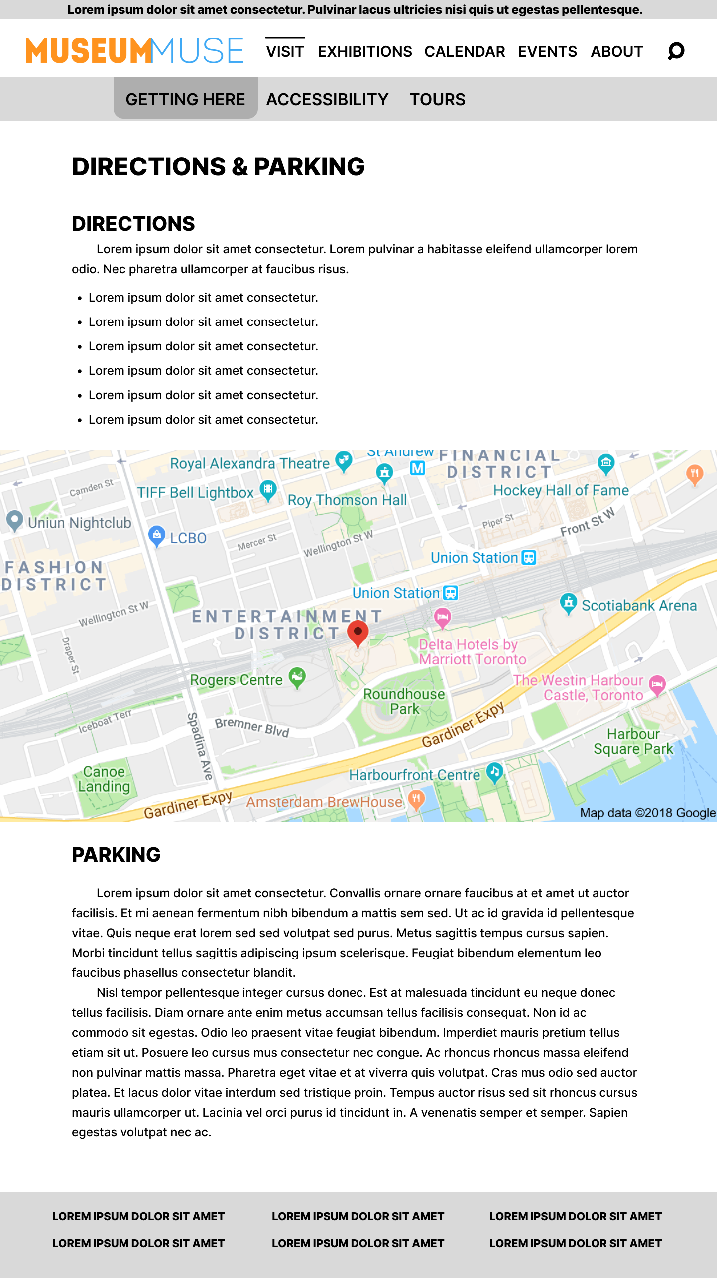
Making sure users had clear and concise directions, as well as detailed instructions for parking was another important aspect for me.

Impact:
Our target users loved the inclusion of very visible events, calendar dates, and the simplicity of the website’s design. The straightforwardness of the navigation was also a big plus as it helped users to immediately find what they were looking for.
What I learned:
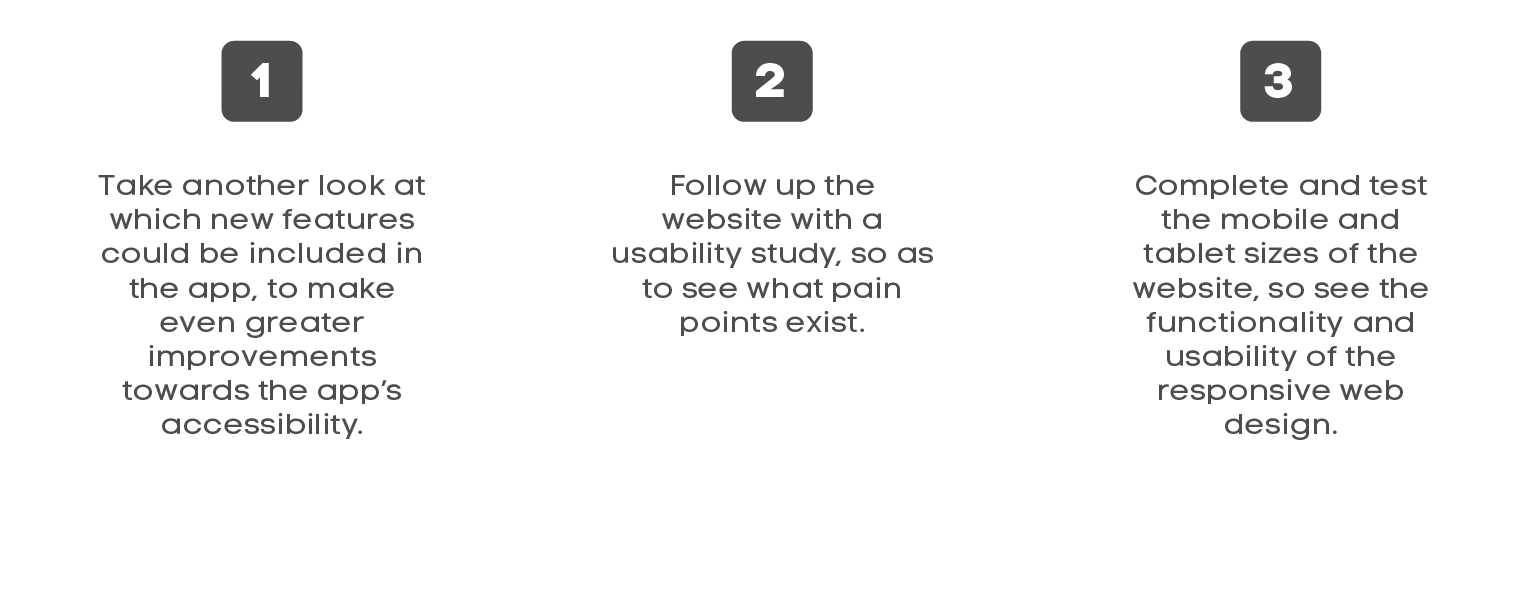
I learned that the design needs to be flexible and adaptable, because the user has different devices they’re using, and many different ways they approach it . The most important takeaway for me is making sure I keep minimalistic designs in order for the graceful degradation process to work.